Following on from my previous post The Aussie Dollar: On Cliff’s Edge here’s an update of what some of the weekly charts are looking like.
Firstly, here’s a chart I’ve been sharing on twitter this week, AUDUSD monthly.
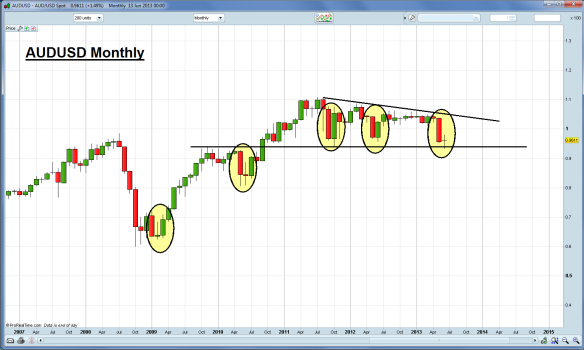
Apart from GFC we haven’t seen much follow through after big red monthly candles.
“This time it’s different”. Interest rates, the economy, China, etc. Maybe. But I’m trading the probabilities here and fully expecting a shorter term bounce (as supported by weekly chart below).
Keep in mind I’m only looking at the probability for the month of June here and not looking beyond. The large descending triangle suggests longer term weakness and an eventual 80c, but of course I’m getting way ahead of myself and beyond my trading timeframe.
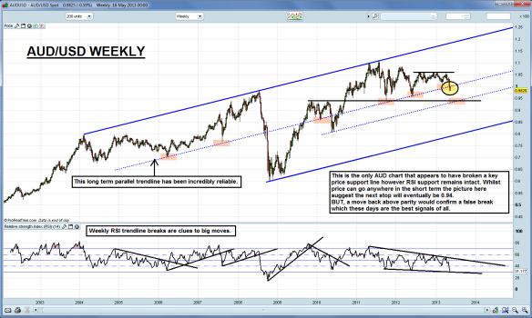
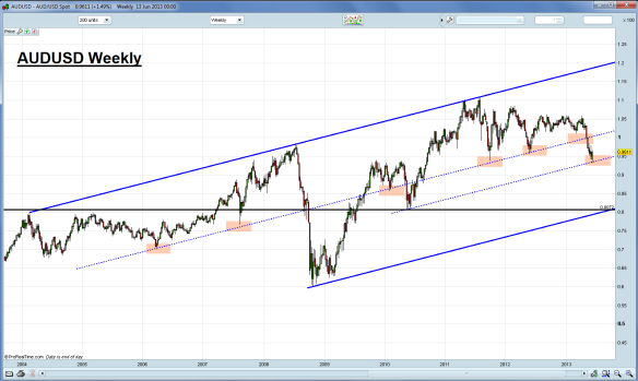
Below is AUDUSD weekly with parallel lines that I’ve had on there for a couple of years now so I trust their reliability.
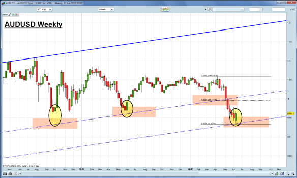
The zoomed weekly below clearly shows the bullish engulfing reversal candle pattern and previous weekly reversal patterns. A 50% retrace (much less than previous reversals) would take us back to 9954.
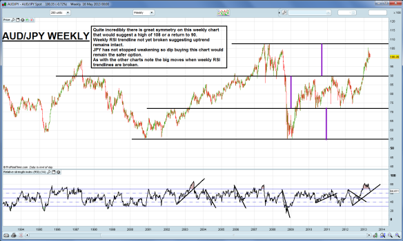
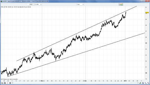
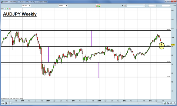
Other AUD crosses are showing similar reversal patterns. AUDJPY weekly below shows the reversal “hammer” candle at a long term support/resistance line.
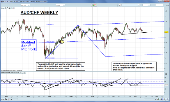
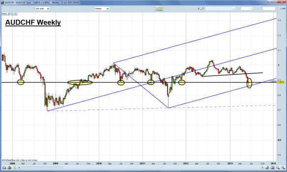
AUDCHF weekly is another interesting chart. First there is a horizontal level that has been KEY many time previously. Being across several years now it’s difficult to give a precise level but the 8850-8900 area is a broad guide to where it should be. The latest candle is a “hammer” reversal bouncing off the pitchfork support tine (which I have re-aligned, thanks to @totterdell91)
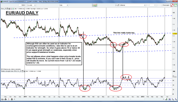
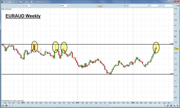
EURAUD weekly below shows similar reversal candles at a key weekly level.
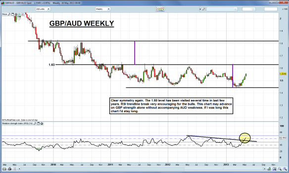
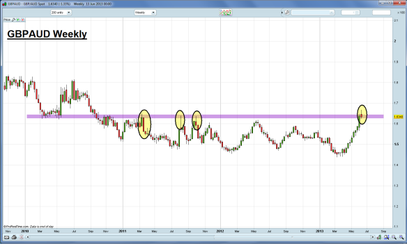
GBPAUD weekly below shows the same. But keep in mind it did make a new 3yr high.
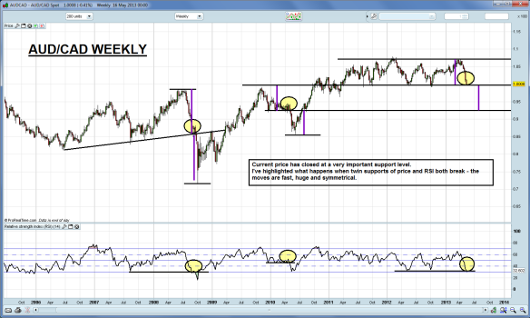
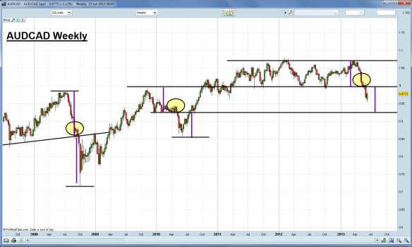
AUDCAD weekly is similar in that it has a reversal candle albeit a weak one. You would have to separately judge the strength of CAD as well and from what I see on USDCAD, the loonie looks stronger than the aussie.
On my previous post I had included the RSI indicator on most charts to support my views. I’ve omitted it this time as I firmly believe price and price action comes first. And the action loudly speaks near term reversal to me and more upside to come.
(One chart that is probably the most important of all the charts in the world right now is the NIKKEI. If 12400 area fails then ignore all the above. :))
10c